Card
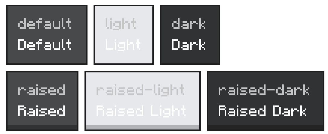
Themed container that wraps the Panel primitive with a Minecraft card background, standard padding, and gap. Use it to group related content into a single visual unit. Six visual variants cover the flat and raised surfaces in default, light, and dark tones.
Import
import { Card } from '@bedrock-core/ore-styled';
Usage
<Card>
  <Text>{'§lInventory full'}</Text>
  <Text>{'Drop items to make room.'}</Text>
</Card>
Cards lay their children out as a column with the theme's standard gap. Override flexDirection, padding, or gap via control props if you need to.
Props
| Prop | Type | Default | Description |
|---|---|---|---|
variant | 'default' | 'light' | 'dark' | 'raised' | 'raised-light' | 'raised-dark' | 'raised' | Selects the background texture. The raised prefix lifts the card visually above the screen surface. The suffix sets the tint: light for a lighter fill, dark for a darker fill, or none for the neutral base. default is the flat neutral card |
children | JSX.Node | — | Content rendered inside the card |
Inherits control props. Use them to size the card, override the default padding, or change the flex direction.
Examples
Variants
<Panel flexDirection={'column'} gap={6} padding={10}>
  <Card variant={'default'}>
    <Text>{'Default'}</Text>
  </Card>
  <Card variant={'light'}>
    <Text>{'Light'}</Text>
  </Card>
  <Card variant={'raised'}>
    <Text>{'Raised'}</Text>
  </Card>
  <Card variant={'raised-light'}>
    <Text>{'Raised Light'}</Text>
  </Card>
  <Card variant={'raised-dark'}>
    <Text>{'Raised Dark'}</Text>
  </Card>
  <Card variant={'dark'}>
    <Text>{'Dark'}</Text>
  </Card>
</Panel>
Two-column card
<Card flexDirection={'row'} gap={10}>
  <Image width={32} height={32} texture={'textures/items/diamond'} />
  <Panel flexDirection={'column'} gap={2}>
    <Text>{'§lDiamond'}</Text>
    <Text>{'§7A rare gem.'}</Text>
  </Panel>
</Card>
Card with action row
<Card>
  <Text>{'§lConfirm purchase'}</Text>
  <Text>{'Spend 32 emeralds?'}</Text>
  <Panel flexDirection={'row'} gap={6}>
    <Button variant={'secondary'} flex={1} onPress={() => {}}>{'Cancel'}</Button>
    <Button variant={'primary'} flex={1} onPress={() => {}}>{'Buy'}</Button>
  </Panel>
</Card>
Nested cards
Use light for inner cards nested inside a raised outer card to maintain depth hierarchy.
<Card variant={'raised'}>
  <Text>{'§lSection'}</Text>
  <Card variant={'light'}>
    <Text>{'Nested content'}</Text>
  </Card>
</Card>
Notes
- Use
raised(the default) as the top-level card on a screen. - Use
lightorraised-lightfor cards nested inside another card so depth hierarchy is visually clear. - Use
darkorraised-darkto draw attention to high-priority or warning content against a standard screen background. - Scope one logical concept per card — don't pile unrelated sections into one card.
- Combine with
Dividerto separate distinct rows inside the same card.